What is data visualization? Well, it’s exactly what it sounds like — using charts, maps, infographics, and other images to visually convey the meaning of data.
There’s nothing particularly new about data visualization. One could argue that ancient cave drawings constitute an early example — even the pie chart, dates back to 1801 when it was used to illustrate the Turkish Empire’s landholdings. What is new over the last few centuries is the sheer volume of data we’re now able to collect, and the endless ways we illustrate it. And among these infinite applications, the use of customer data visualization to understand and improve customer experience has emerged as a crucial tool for businesses.
In this piece, we’ll look at how data visualization is used to convey information for support teams, and we’ll provide explanations and examples of customer journey data visualization in action.
How is data visualization used?
The list of professions and organizations that can make use of data visualization is nearly endless, since basically every industry can benefit from making information easier to understand.
Across all disciplines, there are four primary ways data visualization is used:
To quickly comprehend information: Graphs and charts make information easier to grasp by organizing it into appealing, highly visual elements. For example, looking at a revenue chart that shows an arrow steadily rising upward immediately communicates an improvement. You could learn the same thing by reading multiple monthly sales reports, but that would take longer, and the upward trend would be less immediately apparent.
To identify relationships and patterns: When presented graphically, patterns can emerge from even the most complicated data sets. Data visualization helps us recognize parameters that are highly correlated. (Of course, it’s important to remember that correlation does not equal causation.)
To identify trends: Charts, graphs and dashboards that update in real time often reveal emerging trends that would otherwise escape notice. Recognizing and profiting from a burgeoning trend—either within a single business or in an industry itself—can provide a big advantage over the competition.
To tell a story: Building dashboards and charts is necessary to help “paint a picture” for visual learners. Data can be used to form a narrative, and images help to convey the story. Charts, graphs, infographics, and other visually engaging representations of data can simplify statistics and allow the audience to better follow along.
In short, creating charts, graphs and dashboards are an excellent tool for understanding data, recognizing the repeated patterns and new trends within it, and communicating that information across the organization.
Data visualization of the customer journey
If your company is tracking every customer service interaction, you are generating valuable data capable of providing greater insight into consumer behavior. On their own, individual customer interactions may not reflect the big picture. Taken as a whole, multiple interactions create a large data set that businesses can collect, learn from, and act on.
For example, a graph comparing how many new customers came to your website through search, social media, or paid advertising allows you to visualize the importance and prevalence of each channel in the beginning of the customer journey.
Those types of insights are key to plotting out the customer journey. Customer journey mapping tools track and describe all the experiences that customers have as they interact with your company. A complete map will cover the full life cycle of a customer’s engagement with your company, from first contact to continued retention. Customer journey maps look different for different industries, but they all rely on a wealth of customer data.
Visualizing customer support data
The following customer data visualization examples were created with customer analytics software. Together, they show how common graphics, such as bar charts and line graphs, can reveal how customers interact with your business, providing insights into the all-important retention portion of the customer journey.
Consider what these various customer service reports could tell you about customer interactions with Support:
For starters, these bar graphs show the rate of new support tickets by weekday and hour, allowing you to pinpoint the precise day and time that customers are most likely to contact support.
Covering a longer period of time, this bar graph shows the number of tickets created over a nearly two-year period. Data visualization reveals just how dramatic the spike was in May of 2018 and how the number of tickets decreased to previous levels in the following months.
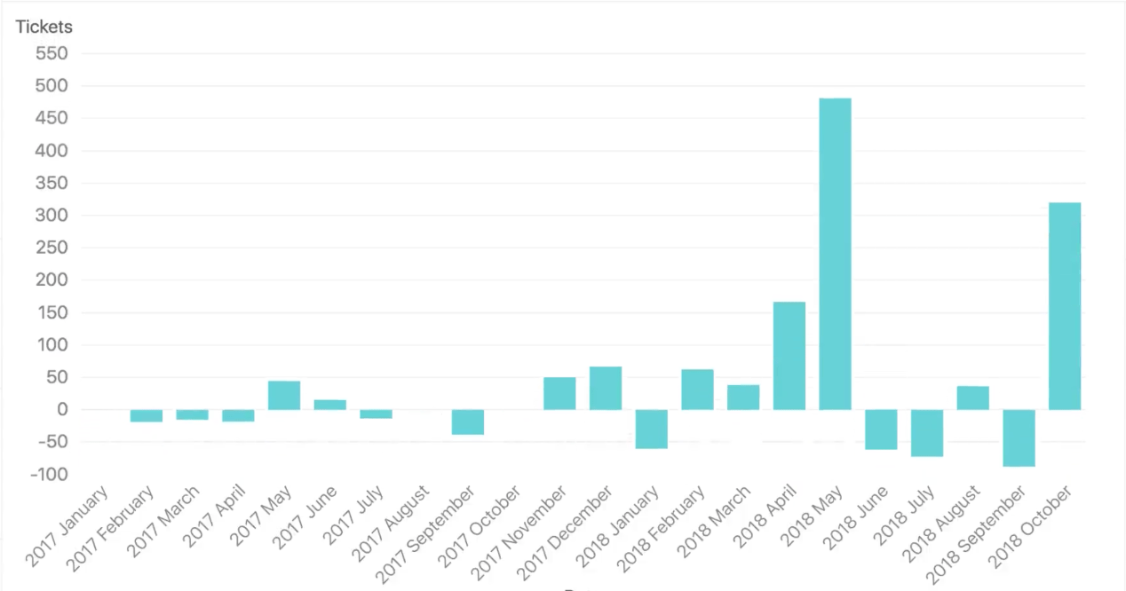
Alternately, this graph covers the same data set but shows the difference in increase or decrease from one month to the next, rather than the raw total. In doing so, it better illustrates the way in which tickets fluctuate from month to month over the same time period.
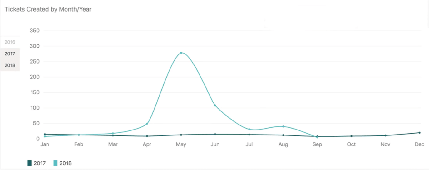
This double line graph juxtaposes the results of 2017 and 2018, allowing you to compare support ticket counts year over year. Similarities in the way both years started and a huge divergence in the spring months are revealed.
Creatings charts and graphs of customer journeys can also illustrate how customers are choosing to engage with you, and how that’s evolving over time. This multiple line graph demonstrates that by charting the usage of different customer service communication channels like chat, voice, and web over the course of several days.
With easily understandable charts like the ones above, support teams can see when and how customers are interacting with them. By seeing the days, times, and communication channels that customers are most likely to use to contact customer service, support teams can work to improve metrics like first response time (FRT) and total time to resolution (TTR) — and see that reflected in their support data. And by looking at historical data on support tickets, they are able to identify potential trends (like what happens when a new product or feature is introduced) and project future results.
Every other aspect of the customer journey can produce useful insights — thanks to software that visualizes customer data. Graphics illustrating the most successful marketing materials, the most popular products and features, the most common customer service issues, and more can all be used to better understand and improve the customer journey.
Customer data visualization provides a new perspective on interactions
Engaging customers means handling a large and constant stream of information. When sales agents are keeping in touch with a sizable roster of clients, or support teams are fielding an influx of tickets, it’s sometimes hard to look at the big picture. Every customer interaction contains valuable pieces of data. The best way for your organization to understand that data is by creating and sharing easily understandable dashboards. For any query, data visualization is the best way to see it from a new point of view.
How is data visualization used to track customer interactions? To learn more data visualization and the importance of tracking customer data, check out this report on the 3 most important customer service metrics.
3 essential customer service metrics
In this free guide, we go over the difference between CSAT and CES, how social media metrics differ from support data, and more.